Statistics 1 Dersi 3. Ünite Özet
Displaying And Graphing Data
Introduction
Looking at numbers sometimes does not reveal all the characteristics of the data that may be telling us. Therefore, in statistical analysis, we do not only include tables but also include the graphical representations of data. There are always various ways to draw information from the data of interest. A practical step to describe the data pattern is to focus on the plots suitable for them. A properly created graph can report various information of the data in a visual form. For instance, the shape of the distribution of the data, the relation between two sets of data, the most repeating observations, outliers, peaks, summary statistics (minimum, maximum, range, mean, median) etc. can be identified from graphics.
The representation of data through their graphics can be a great help for data analysis. Each form of graphs has advantages and disadvantages as different types of data may require different types of graphs. This chapter involves some of the visual representations of qualitative and quantitative (discrete and continuous) data.
Dot Plot
Dot plot will be very useful when the number of objects in our study is rather small such as up to 50 observations. Essentially a dot plot is a one-dimensional scatterplot of observed values of a variable. In order to create a dot plot, one needs to identify the lowest and the highest value of the data set first, then a horizontal axis is drawn and scaled so that it covers the lowest and highest values. A dot plot, essentially, is a simple chart where each observation is presented by a dot along the horizontal axis. If there are repeating observations (multiple occurrences), the dots are stacked up vertically. The dot plots will produce a simple graph of data but at the same time the data itself is never lost, you can easily identify the value of any data point in the dot plot. Example,
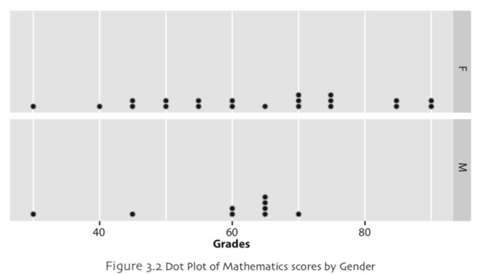
It is especially easy to identify the distribution of a set of data from a dot plot for small and moderate sample sizes. Dot plots tend to be useful to determine a vague point for location of center and spread (variability) of data. Additionally, it may provide some information about groupings, gaps and outliers in the data that may be present. A dot plot is generally not useful for large sizes of data as it may not be possible to display all of individual values with large data sets.
Stem-and-Leaf Display
It was invented by Tukey (1977) as a method of displaying data. In order to understand stem-and-leaf display you should visualize a tree in your mind. Think a branch of a tree, it consists of two parts namely leaves and the branch itself that the leaves are attached to. Now think about a number, stem-and-leaf display can be interpreted like a branch of a tree, for example, number 15 can be represented as multiples of ten. In order to obtain number 15, we have only one multiple of ten and 5 is added, similarly think about number 24, it can be written as 2 times 10 plus 4. As it can be seen from these two values, the common part of the numbers is the multiples of ten. We call this part of the number as the stem of the data and leaf part of the data is the trailing digits of the number such as 5 and 4 in our examples. Example,

A stem-and-leaf display is a type of graph for listing the numerical data and very similar to dot plot. If you remember in dot plot, dots are used to represent each observation in our data. In stem-and-leaf display the original numbers are kept and a visual representation of data is created. Basically, stem-and-leaf display divides the values into a stem and leaf using a vertical line. The “stem” represents the greatest digits on the left of the line where the right of this line displays the “leaf” with the remaining digits. This graph can be useful to figure out the range, outliers, the most frequent values and the shape of the data. It is also useful for assessing the location and spread of the distribution of the data.
One advantage of this display is that the analyst can see the spread of the weights easily and also determine whether the weights are in the upper or lower end of the plot. From the Figure 3.3, it can also be concluded that the distribution of the data is slightly skewed.
Bar Chart
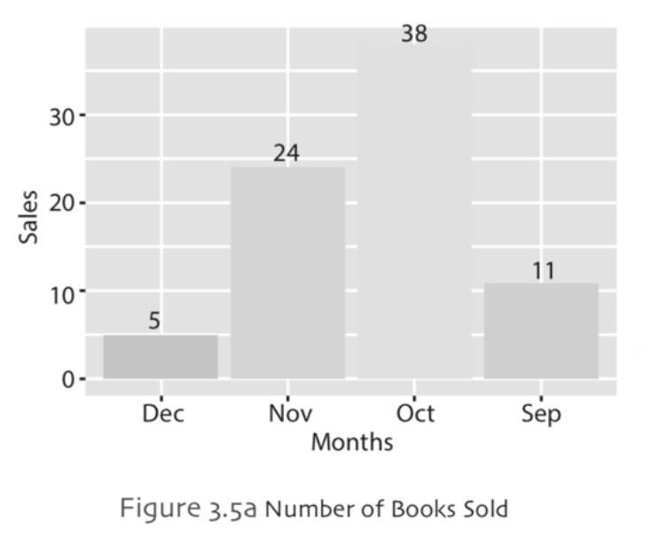
Bar chart is the graphical representation of frequencies by rectangles (or bars) with lengths (or heights) proportional to the frequencies of observations. It can be plotted on a vertical or horizontal axis to represent a categorical data with rectangular bars. The height or length of each bar indicates the size of the category defined by column or raw label, respectively.
Simple Bar Chart: Simple bar chart is used to represent discrete values for each category for a given variable on xaxis (horizontal). The y-axis (vertical) shows the actual numbers that are the bar heights for the corresponding category. Example,
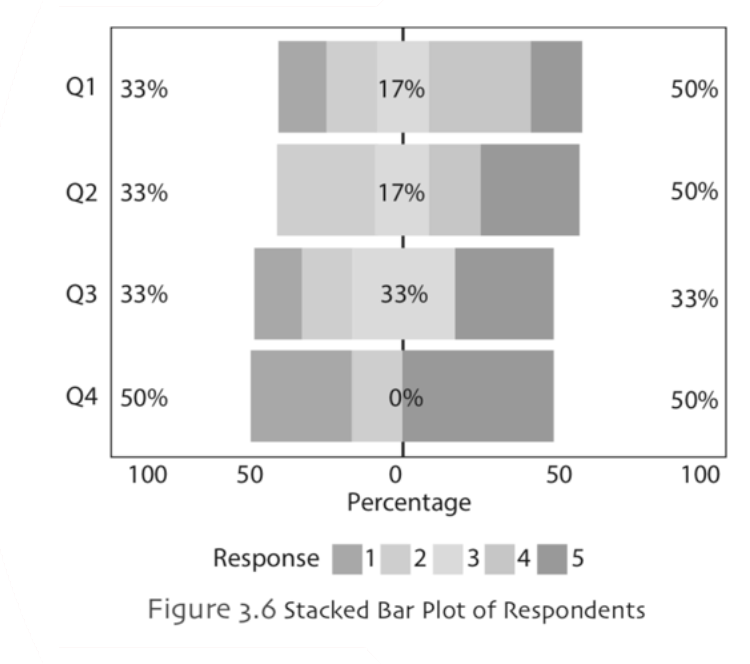
Stacked Bar Chart: The stacked bar chart is a bar chart where each bar is divided into subgroups proportional to the contribution a subgroup makes to associated bar. Likert type items are often represented by stacked bar chart. Example,
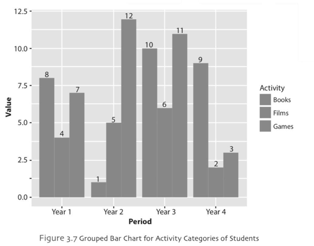
Grouped Bar Chart: The information about several subgroups of each category can be also shown by a grouped bar chart. It can be plotted in horizontal or vertical directions similar to simple bar chart. In grouped bar chart, for each main category there are different subcategories. Example,
Histogram
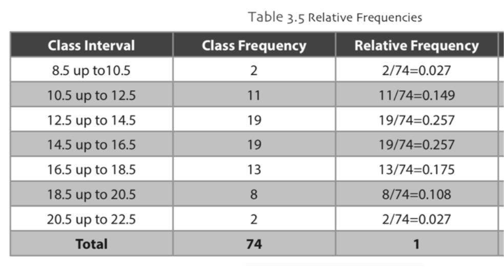
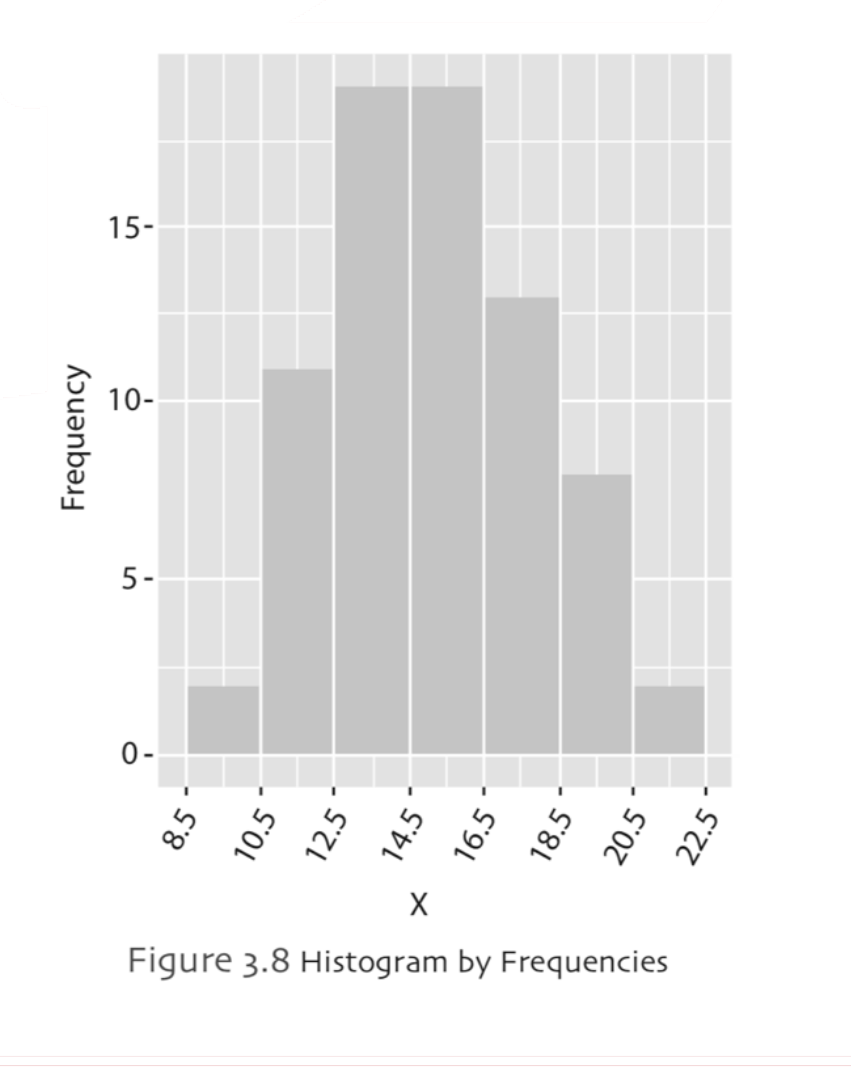
Histogram is a graph that is very similar to a bar chart except that bar charts are drawn for qualitative data, but histograms are drawn for continuous data. In order to draw the histogram of the data, we usually need to have a large sample. If you remember from previous chapters, the data was classified in to grouped frequency distributions, basically you can think histograms as bar plots of grouped frequency distributions. Histograms will help us to identify the center, shape and symmetry of the data. A histogram can tell us about the peaks and extreme values, whether the distribution of data is skewed to the left, skewed to the right, bell-shaped, uniform or bimodal. A histogram can also be used to check out the normality. To construct a histogram, a number of steps must be followed. If you remember in bar plot, we have rectangulars to represent each category, in histogram these rectangulars are called bins. Basically, histogram defines the number of values in the bins (classes) separated by breaks. The widths of the bars/ bins are, usually, equal and the lengths/heights of the bars are defined by its frequency. There are no gaps between bins. The width of each bin represents the corresponding class interval of the variable. Example,
Frequency Polygon
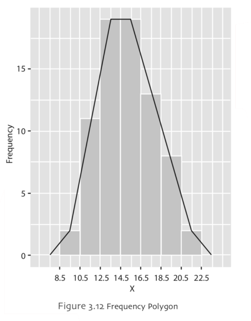
The frequency polygons are useful to discover the overall shape of the data. In order to create the frequency polygon, we use the midpoints of the bins (classes) in histogram vs the frequency of each bin. The midpoints are marked by a dot within each class interval. A straight line is used to connect the dots and so that lines are connected to each other. Example,
Pie Chart
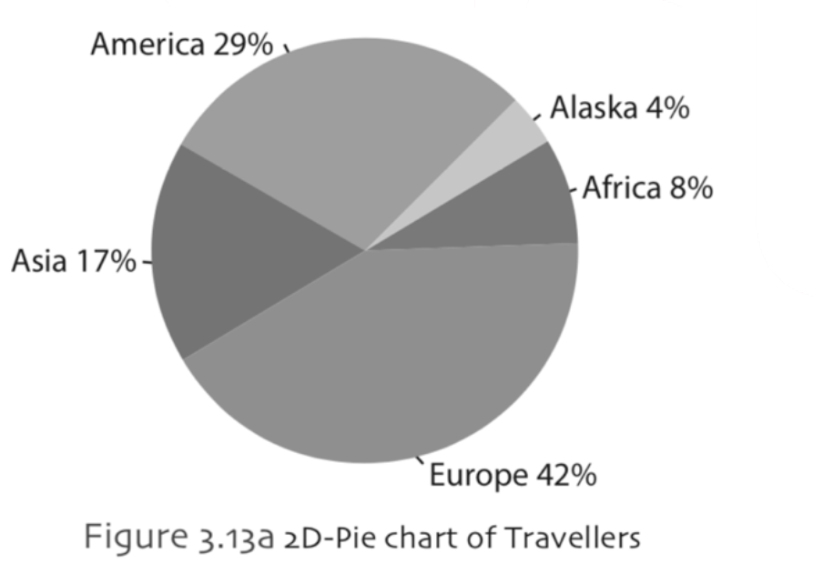
A pie chart is usually used for categorical data. In pie chart components or outcomes of a total frequency is shown as sectors of a circle. The shape resembles to a pie, hence the name of the chart. In pie chart, the categories are divided in to slices/sectors. Each slices’ size is proportional to the total number of objects. Example
Line Chart
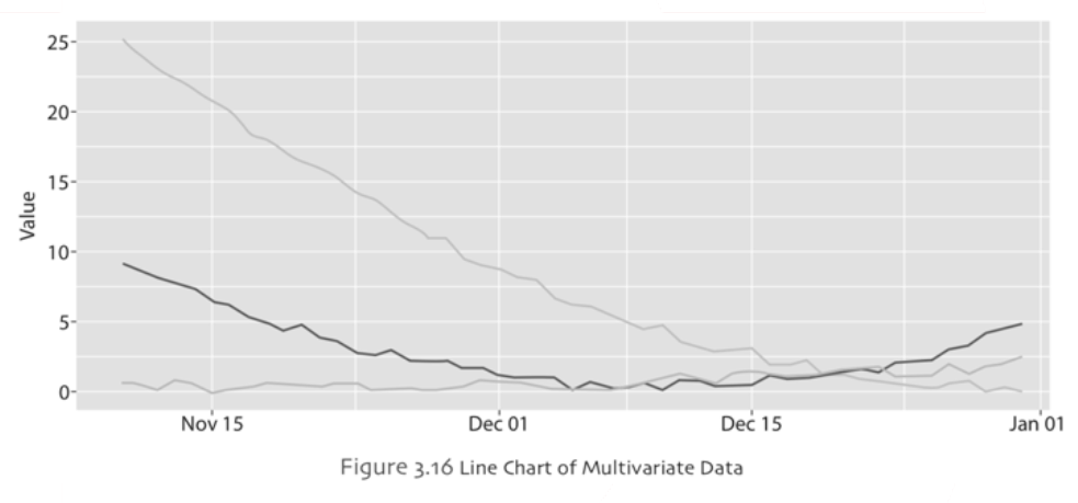
Line chart is often used to display the trends in a continuous data over a period of time. Line chart also works well with discrete (ordered) or categorical types of data. The chart is constructed by intersecting the points by lines on the x-axis. Some line charts are used to draw in two or three dimensions. Additionally, some of the line charts are very helpful to show the relationships for multivariate data. In a simple line chart, there are two variables, a scatterplot of the data points for these two variables are drawn and then the points are connected to each other on x-axis variable. Therefore, it will show in the long term what happens to the variable in x-axis in terms of the variable given in y-axis. Line chart is a useful tool, if the x-axis variable is a time-based variable such as months, using a line chart a producer might be able to see if the sales of a specific product follows a seasonal pattern. If an apparent seasonal pattern emerges for the sales of a product, then the managers may organize the production output accordingly to cope with these seasonal changes. Example: The Figure 3.16 includes three series of data for the same time period. All of these three variables follow a different pattern than the others. One series is very stable, the second series starts with downward trend then picks up at the end of the time period as upward trend and the last series values starts very high and continues to fall until the end of time period of interest in this study.
Scatter Plot
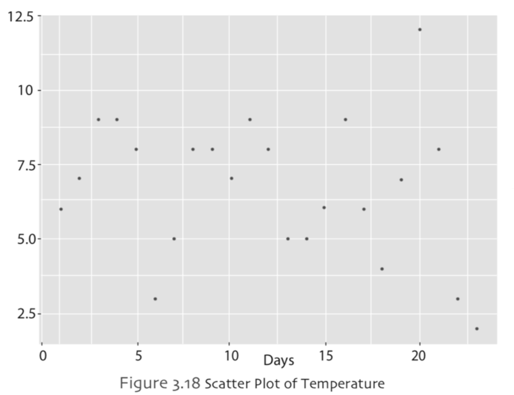
Scatter plot is used to investigate the relationship between two variables. They are also very helpful indicating the minimum, maximum or outliers of the variables. One of the reasons that the scatter plots may be drawn is that scatter plot gives a good indication about the correlation between two variables. To construct a scatter plot, we need two data sets or variables, usually these two data sets or variables are named as X and Y. Once the researcher collects the data about these two variables, all pairwise values in two dimensions are plotted in Cartesian coordinates. The pair of data point for a specific observation, (X, Y), is represented by a dot or a symbol of convenience. The actual numbers are used on the plot; therefore, additional calculations are not necessary unlike pie chart. Variations on scatter plots such as a weighted scatter plot for comparisons and a scatter plot with a trend line are also introduced in the following subsections, respectively. In the future, you will learn advanced statistical technique called regression analysis, when we reach to regression analysis, we will use scatter plot again. In regression analysis problems, the independent variablewill be given on the x-axis and the dependent variable will be given on the y-axis. Example
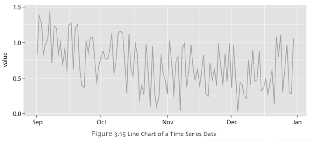
Line chart may help to identify if there is a tendency in data such as upwards trend or downwards trend over a period of time. In Figure 3.15, a simple line chart is constructed using time series data. In this line chart the xaxis represents the time period of interest (five months of data) whereas the y-axis represents the outcomes of a variable that the researcher investigates. It can be seen from this line chart that in the first two months even though there are daily fluctuations, overall there is a downward trend of the values investigated in this study. From the third month and onwards, it looks like the daily fluctuations continue but overall the series become more stable than previous two months.
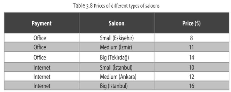
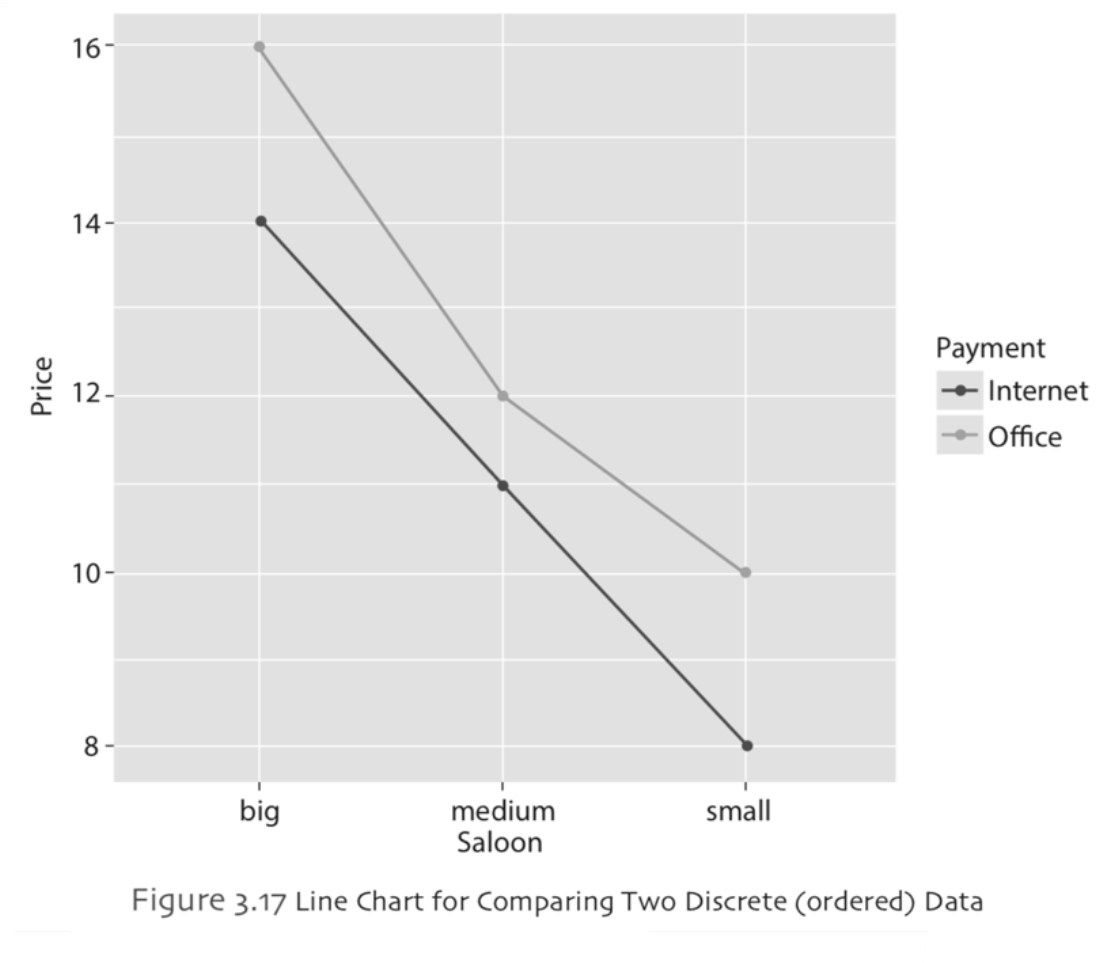
As it was the case in bar chart, a line chart may also be used to compare a discrete data (ordered) with two groups. The Table 3.8 lists the prices of a show in different saloons with two payment options. Notice that the categories of the discrete data is ordered as big, medium and small. Example
-
Çıkmış Soruları Gönder Para Kazan!
date_range 2 Temmuz 2026 Perşembe comment 25 visibility 4664
-
2025-2026 Öğretim Yılı Yaz Okulu Kayıt Duyurusu
date_range 29 Haziran 2026 Pazartesi comment 4 visibility 977
-
2025-2026 Öğretim Yılı Bahar Dönemi Dönem Sonu (Final) Sınavı Sonuçları Açıklandı!
date_range 18 Mayıs 2026 Pazartesi comment 1 visibility 3155
-
AÖF 2025-2026 Öğretim Yılı Bahar Dönemi Dönem Sonu Sınavı sorularına itiraz
date_range 12 Mayıs 2026 Salı comment 1 visibility 1354
-
2025-2026 Bahar Dönemi Dönem Sonu (Final) Sınavı Sınav Bilgilendirmesi
date_range 4 Mayıs 2026 Pazartesi comment 2 visibility 3293
-
Başarı notu nedir, nasıl hesaplanıyor? Görüntüleme : 28037
-
Bütünleme sınavı neden yapılmamaktadır? Görüntüleme : 16403
-
Harf notlarının anlamları nedir? Görüntüleme : 14808
-
Akademik durum neyi ifade ediyor? Görüntüleme : 13935
-
Akademik yetersizlik uyarısı ne anlama gelmektedir? Görüntüleme : 11855